Building a Wearable for Strength
Once I stopped running, my Coros watch became useless. I continued to wear it during my lifts, but the only valuable information it gave me was my heart rate and the time of day. Heart rate zone training was such a systematic way to ensure consistent effort and progress. I began to wonder how a wearable for strength training might work and be useful for serious lifters. A strength training wearable would need to provide important data to guide a lifter's training style and intensity.
My approach and thesis
I began by looking at a variety of sensors currently feasible for a consumer product. EMG, bio-impedance, and non-invasive hormone sensors could provide significant value in the long run. However, due to concerns of usability and scientific limitations, I chose not to pursue these avenues quite yet. Instead, I am focusing on IMUs (inertial measurement units), IMUs are tools that provide movement data. This data can help us approximate how the body is responding to strength training.
Velocity based training is used to study the trends of rep velocity within a set to understand training intensity. For example, as a lifter's bar velocity while bench pressing begins to decrease throughout the set, they are likely nearing failure.
My thesis is that a wrist-worn wearable could use movement velocity to predict how close to failure a lifter is during a set. This would then provide insight into the intensity of each set, which could then be extrapolated to studying broader trends in workout and program intensity.
Taking baby steps
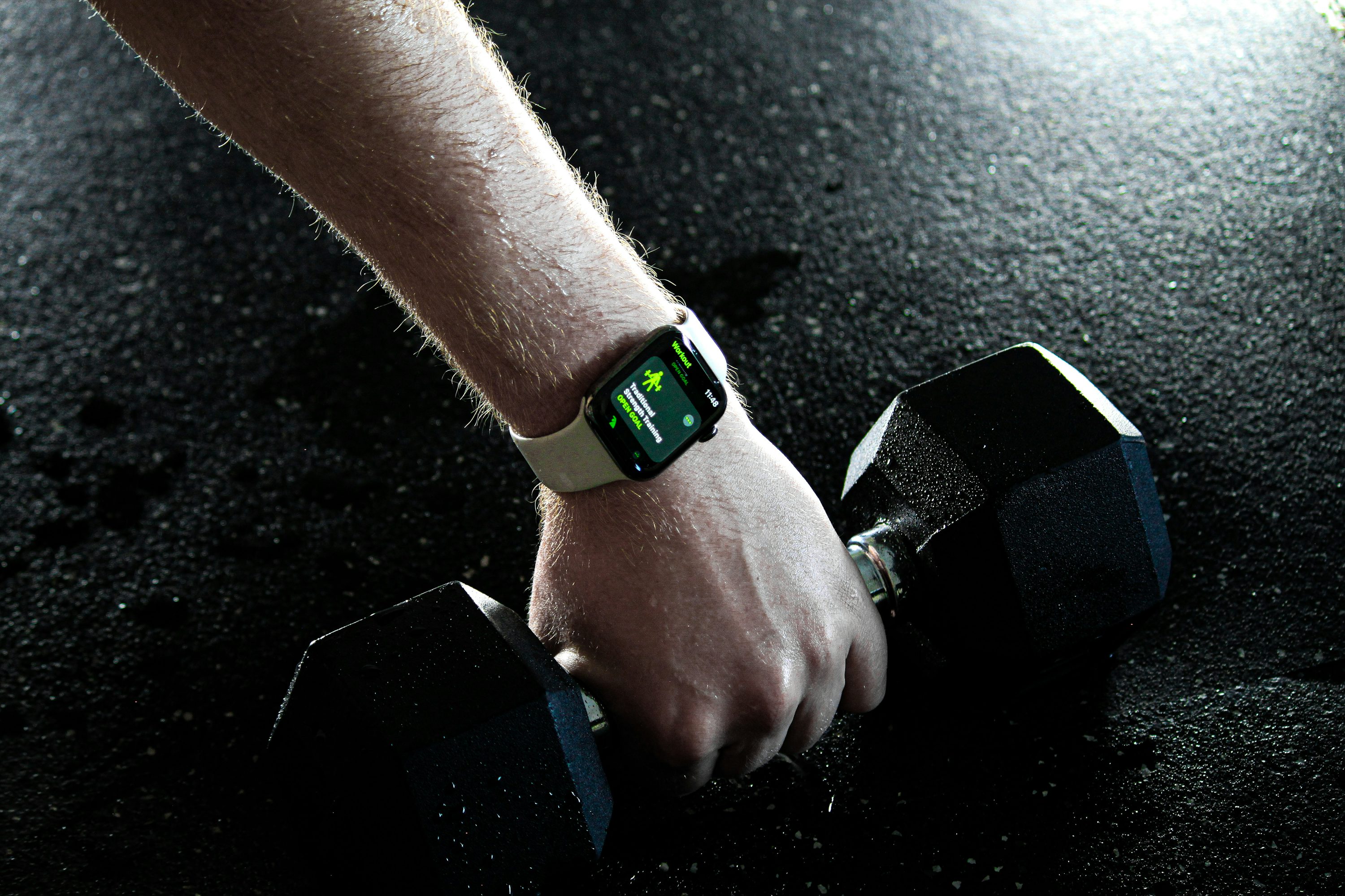
First, I needed a set of exercise data to work with. Apparently I was lied to when I was told "everything is on the internet." So I had to get creative with building my dataset. I haggled a guy on Facebook Marketplace to buy his Apple Watch for only $50. I then downloaded an app called Sensor Logger, which gathers data from a variety of device sensors including the watch's 9-axis IMU. While wearing this Apple Watch, I hit the gym for a brutal upper body lift, recording data from every set to failure. I finally had some data to work with.
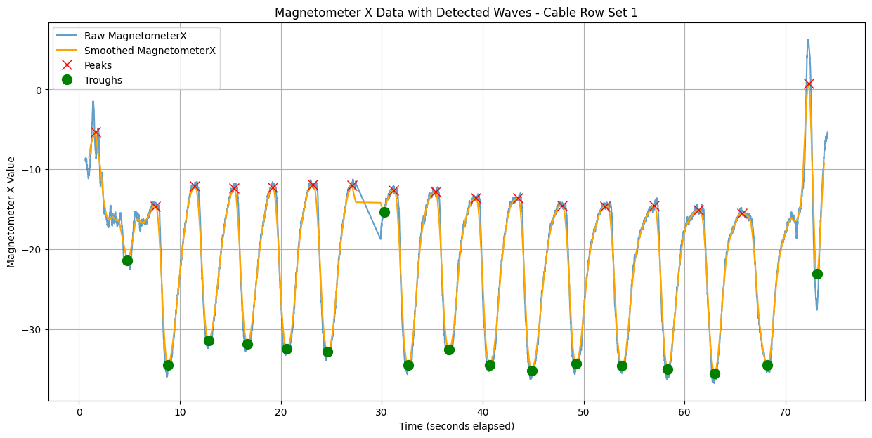
The next step was to visualize the data. Starting with cable rows, I used Python to create visualizations of the movement of each set. The eccentric and concentric movements demonstrated a sinusoidal pattern as seen below. I then created a systematic way to identify the peaks and troughs of each rep. As you can see, the current method isn't perfect and still needs work as the movement noise at the beginning and end of the set is being counted.
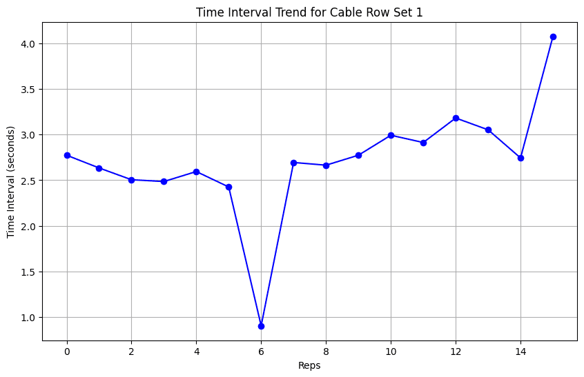
A pair of a peak and a trough signify a single rep within a set. The difference in seconds elapsed between the peak and trough can temporarily be used as a proxy for "velocity of a rep." Then we can visualize the trend of the rep time as seen below. My initial observation is that—aside from slight abnormality—there is an evident upward trend in the data that shows that reps take longer as the lifter gets closer to failure.
What I'm working on now!
Join the waitlist at spur.fitness
I am nearing completion on the MVP of an iPhone and Apple Watch App to help users utilize the insights I'm studying above. I'm building fast and haven't had a chance to update this page recently, but I hope to begin beta-testing in April. I will be sharing my insights here so make sure to check back soon!
Check back here for future updates!
This project is a work in progress as of March 2026